The Difference Is Clear

The Difference Is Clear is the PURELL® brand 2023 B2B enterprise campaign. The campaign’s goal was to increase traffic to GOJO.com which in turn would increase sales and conversions. To reach this goal, we wanted to show KDMs what makes the PURELL® brand different (and better) than competitors.
Through messaging and design, this theme drives home the concept that not all hand sanitizers and surface disinfectants are the same. The Difference Is Clear. . . What difference, you ask? It’s the difference people feel the moment they see the PURELL® brand. It evokes confidence and trust in the places that use PURELL® hand and surface products. They can feel the difference on their skin every time they wash or sanitize their hands. And they notice it in the efficiencies PURELL® surface products create. That’s because the PURELL® Difference starts with people and ends with industry-leading products that meet real-life needs.
From concept to execution, I worked with the content team and B2B client team to create a powerful and successful campaign that took PURELL® to new heights. Campaign assets included Stack Adapt banners, native ads, and social posts.
In just Q1, there were 49+MM paid media impressions — 259k clicks, 81k site sessions, and 20k conversions. There was a strong click-through performance of 54% which was 33% above the benchmark.
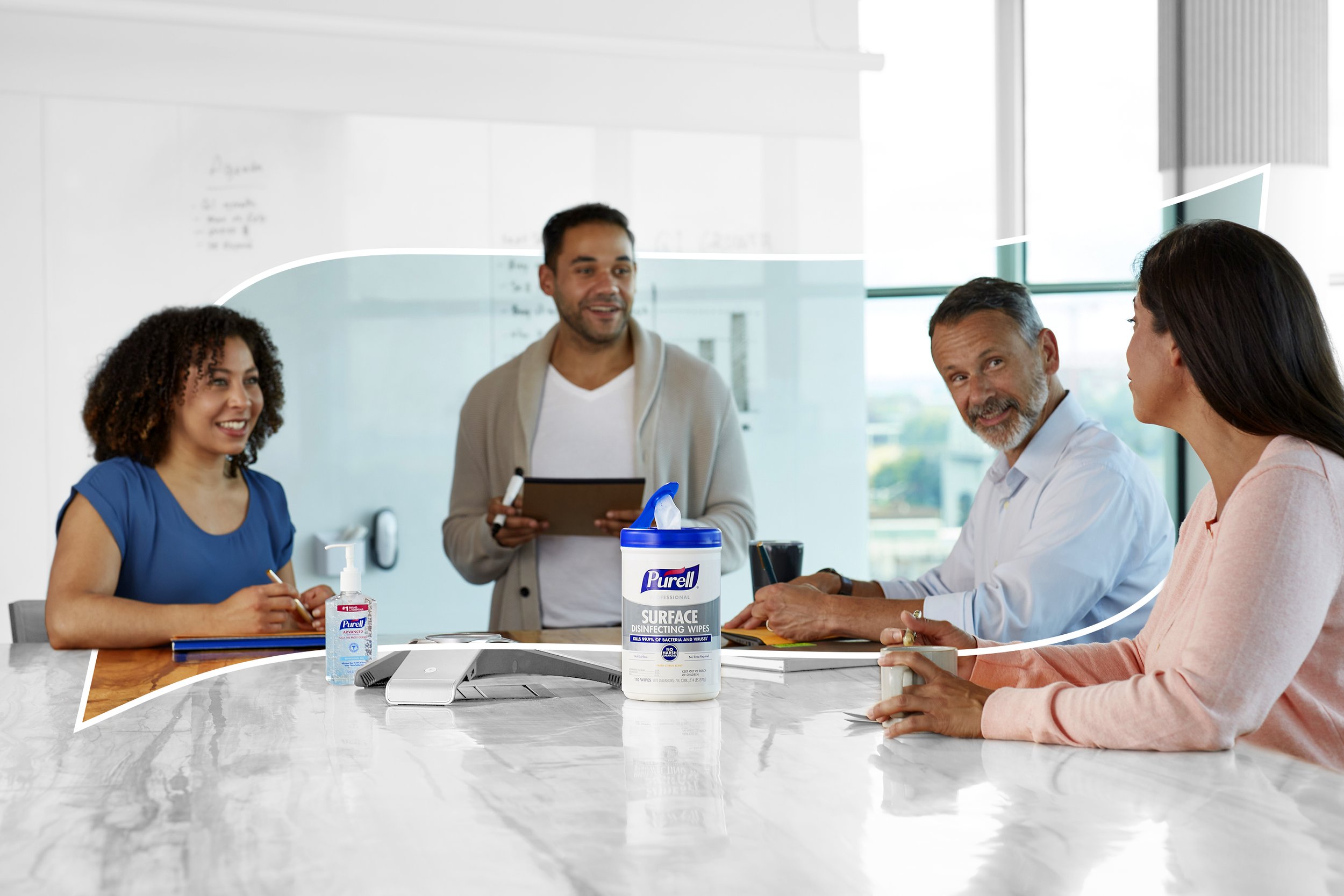
The style guide to this campaign is unlike anything PURELL® has done in the past. I took a creative leap in manipulating our imagery to high-key grayscale and letting the products and people pop in color. The intention for this was to metaphorically show how PURELL® stands out in its environment and to create a visual difference that was immediately clear.
There’s two levels to this campaign — awareness phase and retargeting phase. Awareness level ads had softer messaging and CTAs that were directed at a larger audience while the retargeting level ads targeted repeat viewers and worked harder to drive conversions. There were also visual differences — awareness level ads show scenes of people interacting in a moment that could be viewed as a high-risk for germs and bacteria. Sometimes the PURELL® logo’s “halo” shape was incorporated and created a colored space within the grayscale environment, implying that with PURELL®, a safe space is created. The retargeting level focused more on specific products with a hint of human interaction (i.e. hands using surface wipes). The products and people are still in color against a grayscale environment, but the scene is zoomed in on the in-use product.


